Error Analysis for NER models & datasets

Error Analysis is an important but often overlooked part of the data science project lifecycle, for which there is still very little tooling available. Practitioners tend to write throwaway code or, worse, skip this crucial step of understanding their models’ errors altogether. This project tries to provide an extensive toolkit to probe any NER model/dataset combination, find labeling errors and understand the models’ and datasets’ limitations, leading the user on her way to further improvements.
Documentation | Slides | Github
# Install requirements
pip install -r requirements.txt  # you'll need Python 3.9+

# Run
make runSome interesting visualization techniques contained in this project:
Libraries important to this project:
streamlit for demoing (custom multi-page feature hacked
in, also using session state)plotly and matplotlib for chartingtransformers for providing the models, and
datasets for, well, the datasetsecco for
visualizing the neural net activationssentence_transformers for finding potential
duplicatesscikit-learn for TruncatedSVD & PCA,
umap-learn for UMAPActivations
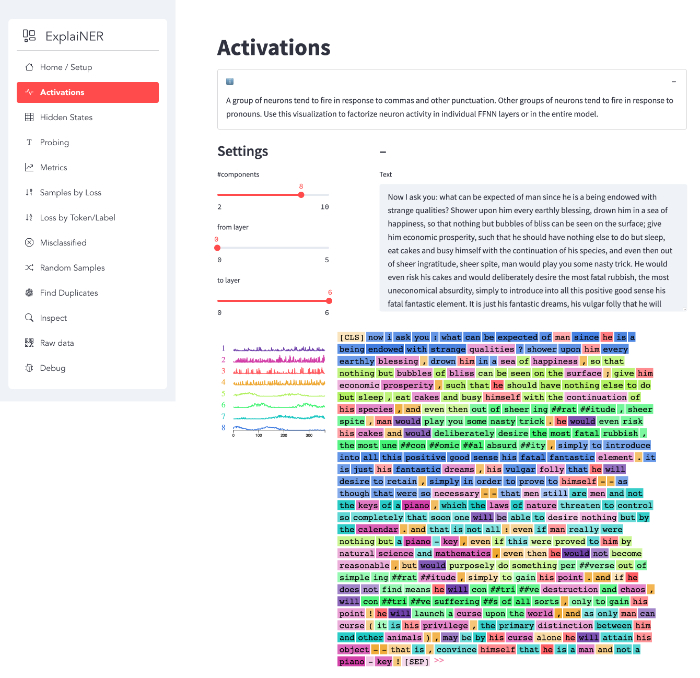
A group of neurons tend to fire in response to commas and other punctuation. Other groups of neurons tend to fire in response to pronouns. Use this visualization to factorize neuron activity in individual FFNN layers or in the entire model.
Hidden States
For every token in the dataset, we take its hidden state and project it onto a two-dimensional plane. Data points are colored by label/prediction, with mislabeled examples marked by a small black border.
Using these projections you can visually identify data points that end up in the wrong neighborhood, indicating prediction/labeling errors.
Probing
A very direct and interactive way to test your model is by providing it with a list of text inputs and then inspecting the model outputs. The application features a multiline text field so the user can input multiple texts separated by newlines. For each text, the app will show a data frame containing the tokenized string, token predictions, probabilities and a visual indicator for low probability predictions – these are the ones you should inspect first for prediction errors.
Metrics
The metrics page contains precision, recall and f-score metrics as well as a confusion matrix over all the classes. By default, the confusion matrix is normalized. There’s an option to zero out the diagonal, leaving only prediction errors (here it makes sense to turn off normalization, so you get raw error counts).
With the confusion matrix, you don’t want any of the classes to end up in the bottom right quarter: those are frequent but error-prone.
Misclassified
This page contains all misclassified examples and allows filtering by specific error types. Helps you get an understanding of the types of errors your model makes.
Loss by Token/Label
Show count, mean and median loss per token and label.
Look out for tokens that have a big gap between mean and median, indicating systematic labeling issues.
Samples by Loss
Show every example sorted by loss (descending) for close inspection.
Apart from a (token-based) dataframe view, there’s also an HTML representation of the samples, which is very information-dense but really helpful, once you got used to reading it:
Every predicted entity (every token, really) gets a black border. The text color signifies the predicted label, with the first token of a sequence of token also showing the label’s icon. If (and only if) the prediction is wrong, a small little box after the entity (token) contains the correct target class, with a background color corresponding to that class.
For short texts, the dataframe view can be sufficient, but for longer texts the HTML view tends to be more useful.
Random Samples
Show random samples. Simple method, but it often turns up interesting things.
Find Duplicates
Find potential duplicates in the data using cosine similarity.
Inspect
Inspect your whole dataset, either unfiltered or by id.
Raw data
See the data as seen by your model.
Debug
Debug info.