For this exercise I visualized CO2 emission data from nearly every country of the world combined
with their population numbers over the last five decades. The main questions I wanted to answer
with this visualization are:
How much CO2 emissions are produced by each country per year?
How much CO2 emissions are produced per capita per country?
How do the CO2 emissions change over the years?
Data Set
To acquire all necessary data that is need for this visualisation, I combined multiple data
sets. Additionally, a data set with longitudes and latitudes of each country is needed to
place each bar. The data-set CO2 Emission by countries Year wise (1750-2022) includes
CO2 emission data and country size. The included population numbers are only from the year 2022,
which I replaced with data from World Population by Countries Dataset (1960-2021).
In the end I used data from 1960 to 2020, but could only include complete data sets.
Therefore not all countries are represented in the visualization.
CO2 Emissions
This data set provided information on CO2 emissions per country per year from 1750 to 2022.
Population
This data set provided information on population per country from 1960 to 2021.
Longitude\Latitude
This data set provided information on longitude and latitude values for each country.
Justification
For this visualisation it is not only important to show viewers the numbers on CO2 emissions, but
also give them information on how large individual countries and their populations are. As this
information should be as accurate as possible, I will not be using a 2D map (Mercator Projection)
and instead use a 3D globe. Even though there is an accurate depiction of the world on a 2D
projection, AuthaGraph, it is hard to read for novice users.
Marriott et al.
discussed different studies comparing spatial and spatio-temporal data visualizations in 2D and
3D. They came to the conclusion that neither one is exclusively superior to the other, but there
are potential benefits to the users’ understanding of complex data in immersive visualizations.
Therefore, I will be using an immersive visualisation with an interactive 3D globe.
Approach
To create this immersive visualisation, I used a Unity framework (2022.3.37f1) with the XRInteractionToolkit (3.0.3).
It runs on the Meta Quest 2 via Quest Link on Windows.
There are different approaches on how to represent spatio-temporal data.
Satriadi et al.
provides a variety of visualization options for quantitative data on 3D globes. One approach
includes 3D bars which are aligned with the normal of the surface.
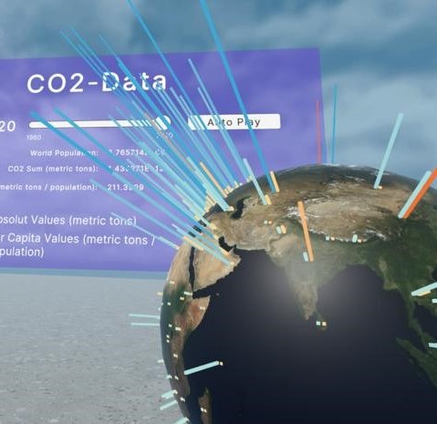
This way, the height of the bar
describes the amount which can also be color coded. The placement of the bar would be the center
of the country, to be able to clearly identify which bar belongs to which country.
As for the interactivity, the user can select
if either the total emissions, the per capiata emissions or if both are visible. In addition, a slider
gives the user the option to select a year, or auto-play through all available years. The globe is
also sizable, movable in space, and can rotate along the y-axis.
For additional information, the user can hover individual
bars and will get insight into that specific data (current amount, country, population, per capita).
Lastly, an info panel shows the world population,
the overall CO2 emissions in metric tons, and the overall per capita emission
(calculation basis are the countries that are present in the data set).